Area, bar, and line chart visualizations
Area, bar, and line charts are based on the same concept of charting data on the X- and Y-axes. You can select a chart type, based on the way that you want to display and compare data.
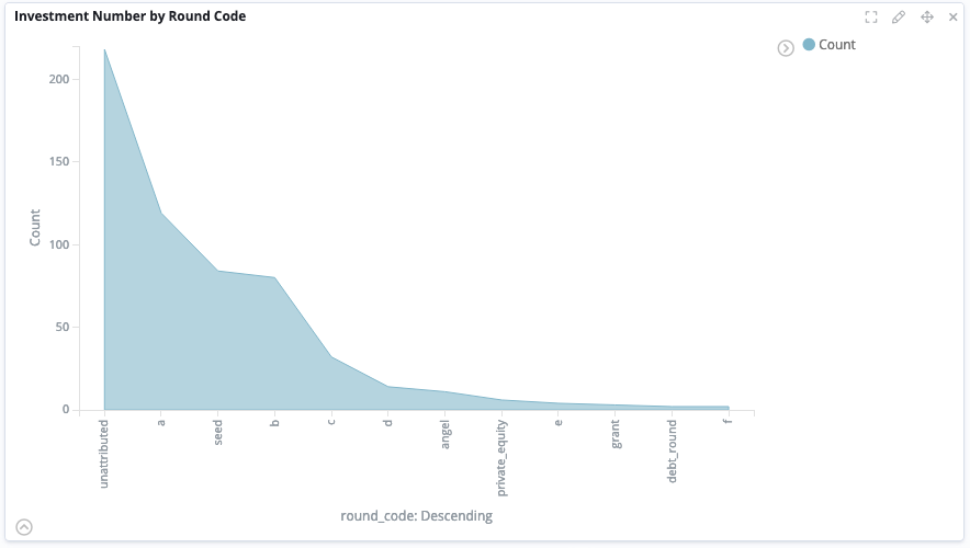
Area chart
You can create an area chart to display and compare graphically-quantitative data. The areas between the axes and the lines can be emphasized with contrasting colors.

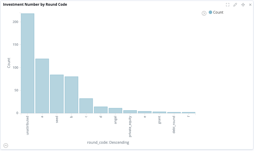
Bar chart
You can create a bar chart to present categorical data with rectangular bars with heights or lengths proportional to the values that they represent. The bars can be plotted vertically or horizontally.

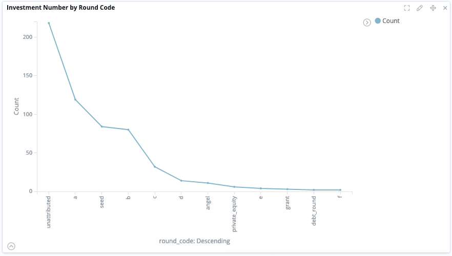
Line chart
You can create a line chart to display trends in your data as represented by a series of data points called 'markers', which are connected by straight-line segments.

To create one of these visualizations, follow the steps in Creating a visualization and select the entity table that you want to display in the chart.
After you select aggregations from the dropdown menus, more fields are displayed. You can select the fields that will appear in the chart, configure their order, and define how they are displayed.
Combining and configuring charts
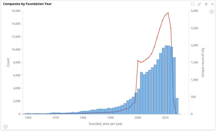
You can combine area, line, and bar charts and you can display more than one aggregation on the X- or Y-axis.

For more information about the configuration options that are available, see Configuring area, bar, and line charts.