Adding visualizations to dashboards
-
In an open dashboard, click Edit [note] → Add from the Options menu.
-
Either select an existing visualization or click Add a Visualization.
-
Choose the visualization type. For more information, see types of visualization.
-
Specify a search query to retrieve the data for your visualization:
-
To enter new search criteria, select the index pattern for the indices that contain the data you want to visualize. This opens the visualization builder with a wildcard query that matches all the documents in the selected indices.
-
To create a visualization that is based on an entity table or search, select one from the Data from dropdown menu. This opens the visualization builder and loads the selected query.
When you build a visualization from an entity table or search, any subsequent modifications that are made to them are automatically reflected in the visualization. If this makes the visualization unsuitable, you can connect it to a different compatible entity table or search.
-
-
In the visualization builder, choose the aggregation for the visualization’s y-axis. For more information, see Y-axis aggregations.
-
For the visualizations x-axis, select a bucket aggregation. For more information, see X-axis aggregations.
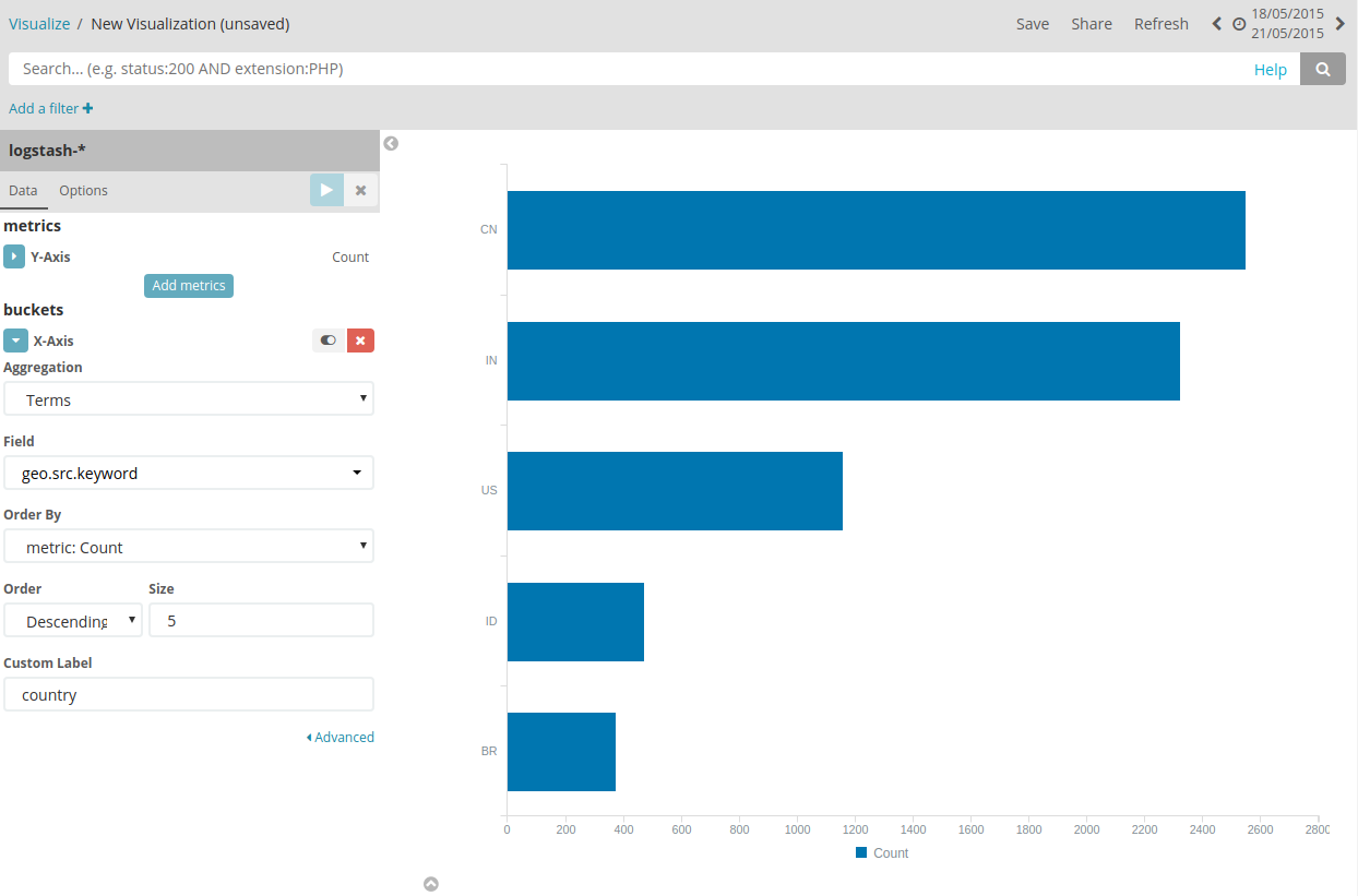
For example, if you are indexing Apache server logs, you could build a
horizontal bar chart that shows the distribution of incoming requests by
geographic location by specifying a term’s aggregation on the
geo.src field:

The y-axis shows the number of requests received from each country, and the countries are displayed across the x-axis.
Bar, line, or area chart visualizations use metrics for the y-axis and
buckets for the x-axis. Buckets are analogous to SQL GROUP BY
statements. Pie charts, use the metric for the slice size and the bucket
for the number of slices.
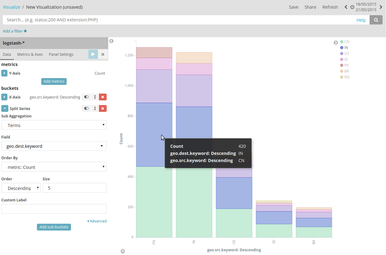
You can further break down the data by specifying sub aggregations. The first aggregation determines the data set for any subsequent aggregations. Sub aggregations are applied in order—you can drag the aggregations to change the order in which they are applied.
For example, you could add a terms sub aggregation on the geo.dest
field to a vertical bar chart to see the locations those requests were
targeting.

Note:
{permission-text}
saved object permissions
and
access control app
(for the default HOME dataspace) or
creating dataspaces
(all other dataspaces).