Creating 360 dashboards
With the Dashboard 360 feature, you can design a dashboard that contains visualizations that are based on different entity tables and apply filters across all of the available data.
To do this, you must create a dashboard-specific data model.
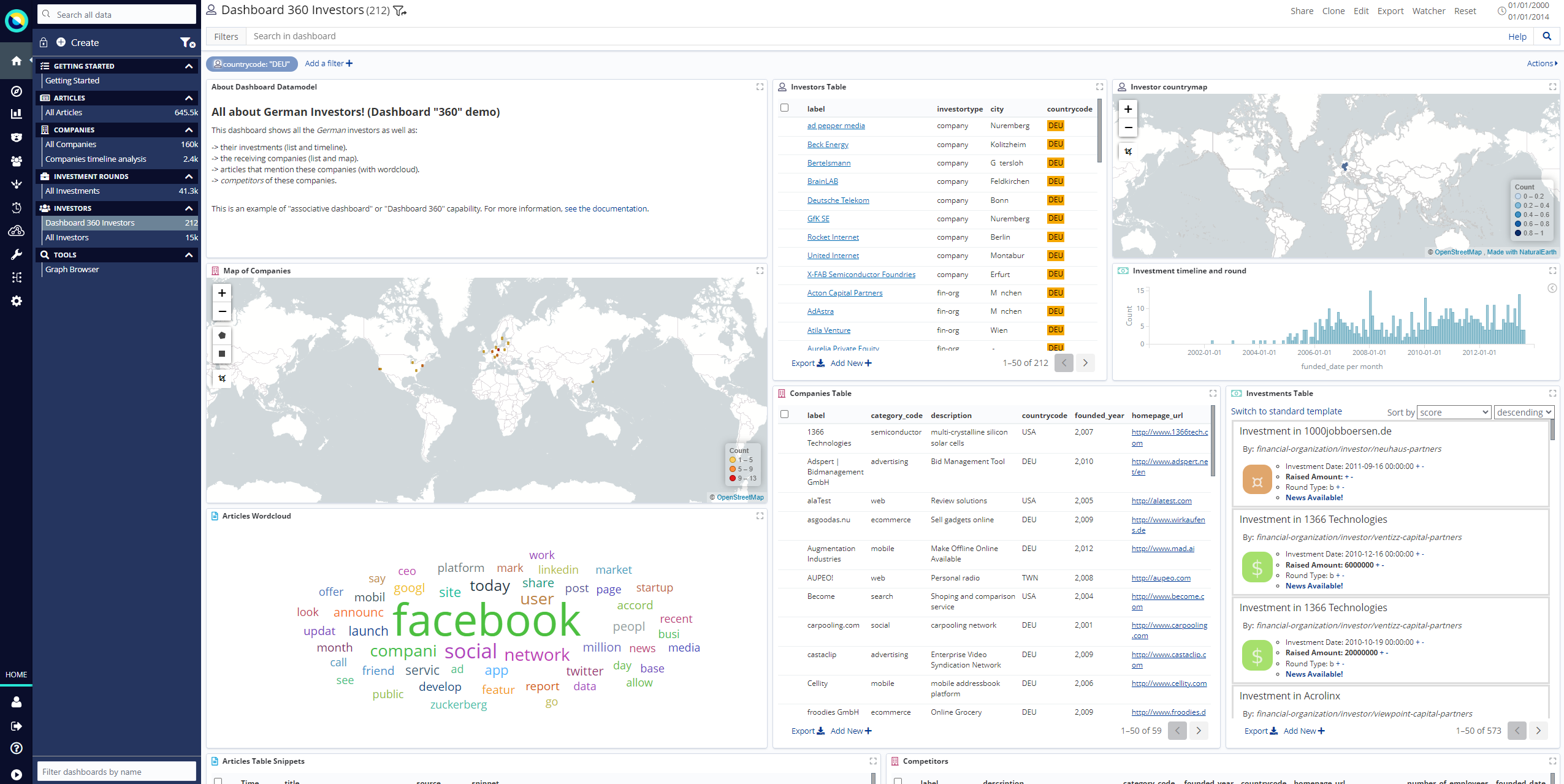
In the following screenshot, there are three entity tables that are being sourced for the visualizations in the Dashboard 360 Investors dashboard: companies, investors, and investments.
From the icons on each visualization, you can tell which entity table or search it is linked to.

|
In a 360 dashboard, you can search for data by entering a query in the Search bar. However, the search targets only the main search, which you specify in the data model. |
Creating a data model for Dashboard 360
To explore related visualizations, you must create a dashboard data model that defines how the 'main' entity table for the dashboard is going to be relationally joined with the other entity tables.
-
After you have created a basic dashboard and added visualizations to it, click Edit [note] → Data Model.
-
Select Dashboard 360 with filter strategy.
-
Select Left join filter.
-
Click Add Main Search, which is the same concept used in Dashboard represents an entity table. This opens a dialog where you can select the relevant entity table.
-
In the dialog box, select the entity table that you are using as the main search and click Done. The Mapping visualization to searches panel shows the list of Dashboard 360 compatible visualizations and whether or not they are assigned to a search node.
A warning icon indicates that a visualization is not yet assigned to a search node.
-
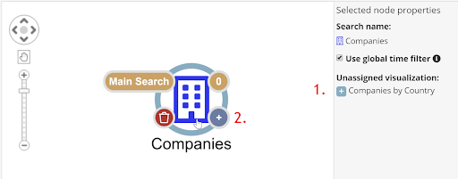
To assign a visualization, click the entity node to select it, then click the plus + button beside the required visualization (1).

-
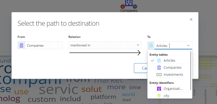
You can now build the dashboard data model by defining how this search is to be relationally connected with other searches (that is, which path in the relational data model to take). To do this, click the plus button on the lower-right of the Main Search node (2). This opens a dialog that shows all of the possible relations that come from the chosen entity table, as well as all possible entity tables that can be reached through those relations.
-
Select the desired entity table, relation and click Done.
 This adds other entity tables to the dashboard data model so that visualizations can be connected to the appropriate entity table or search.
After this process is complete and the dashboard is saved, filtering will work coherently across the visualizations.
Left Filter Join and Inner Filter Join
When Dashboard 360 is selected, you can specify either a Left Filter Join or an Inner Filter Join.
If Inner Filter Join is selected, this immediately hides from any entity table all the records that are not fully connected (related) to records in the other entity tables.
For example, if Inner Filter Join is selected and the companies entity table is connected to the articles, investments, and investors entity tables, then only 5,615 companies remain; each of these is guaranteed to be connected to at least one article and one investment (which in turn is connected to at least one investor).
The Inner Filter Join logic can be too restrictive in many scenarios as it often removes many records from the main entity table (all those that are not fully relationally connected).
To gain a broader view of the data, the Left Filter Join logic filters the Main Search only if an explicit filter is present on one of the other entity tables or searches that are connected to the dashboard data model.
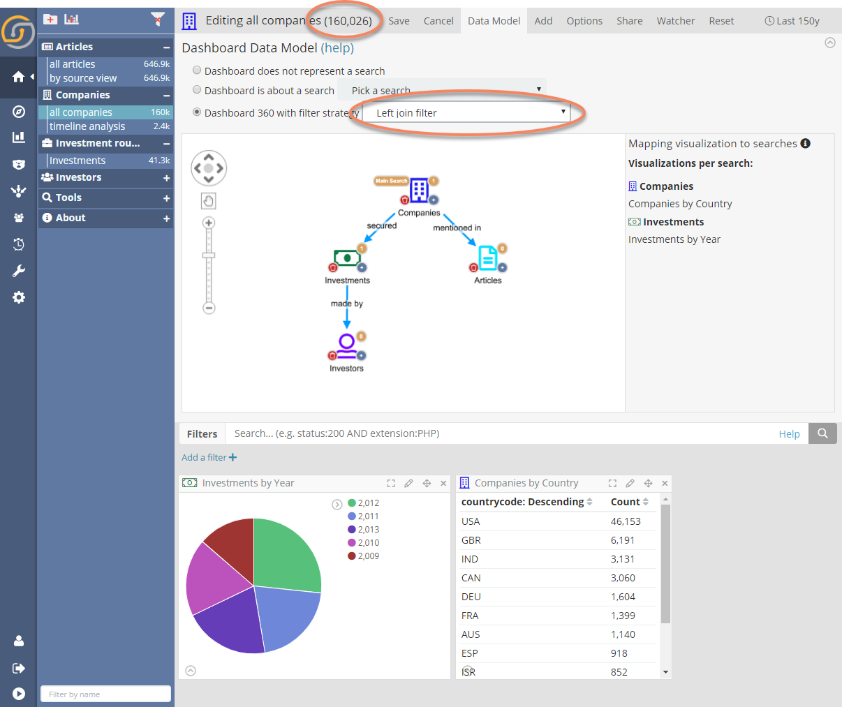
In our example, selecting Left Filter Join now makes all the companies appear (160,026).
Visualizations that refer to entity tables or searches other than the Main Search still display only the records that are relationally connected to those in the Main Search. For example in the following screenshot, the pie chart Investment by Year only shows records that are connected to the companies entity table.
|
When you use a Left Filter Join, if a filter is applied to one of the child searches, the behavior is reverted to the same as the Inner Filter Join. |

When visualizations are part of the Dashboard 360 data model, they display an icon in the top left of their container.
|
Hover your cursor over the icon to display which node of the dashboard data model they are connected to and the current status of the filters. |
Note:
{permission-text}
saved object permissions
and
access control app
(for the default HOME dataspace) or
creating dataspaces
(all other dataspaces).