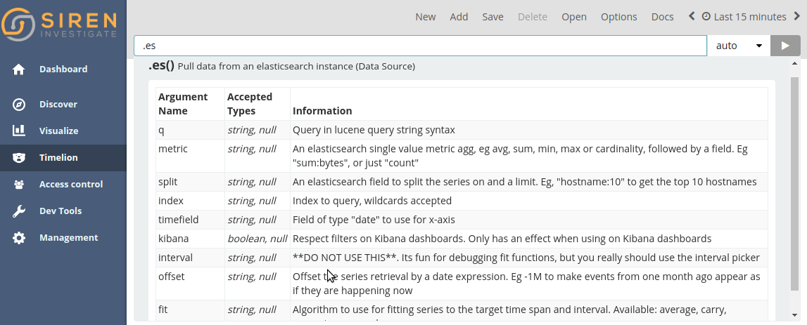
Timelion
Timelion is a time series data visualizer that enables you to combine totally independent datasources within a single visualization. It’s driven by a simple expression language you can use to retrieve time series data, perform calculations to tease out the answers to complex questions, and visualize the results.
For example, Timelion enables you to easily get the answers to questions like:
-
How many pages does each unique user view over time?
-
What is the difference in traffic volume between this Friday and last Friday?
-
What percent of Japan’s population came to my site today?
-
What is the 10-day moving average of the S&P 500?
-
What is the cumulative sum of all search requests received in the last two years?
You may also be interested in these tutorial videos:
Getting started with Timelion
Timelion is a time series composer. The following sections form a tutorial to help you start using Timelion.
Creating time series visualizations
This tutorial will be using the time series data from Metricbeat to walk you through a number of functions that Timelion offers. To get started, download Metricbeat and follow the instructions here to start ingesting the data locally.
The first visualization you will create will compare the real-time
percentage of CPU time spent in user space to the results offset by one
hour. To create this visualization, we will need to create two Timelion
expressions. One with the real-time average of system.cpu.user.pct
and another with the average offset by one hour.
To start, you must define an index, timefield and metric in
the first expression. Go ahead and enter the following expression into
the Timelion query bar.
.es(index=metricbeat-*, timefield='@timestamp', metric='avg:system.cpu.user.pct')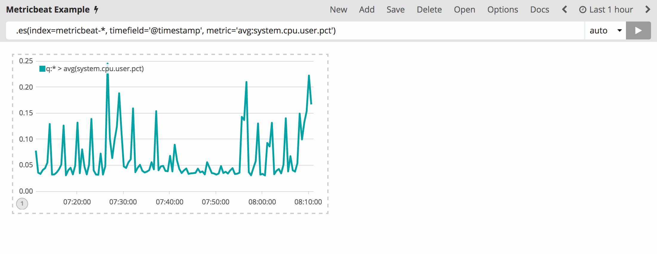
Now you need to add another series with data from the previous hour for
comparison. To do so, you will have to add an offset argument to the
.es() function. offset will offset the series retrieval by a
date expression. For this example, you will want to offset the data back
one hour and will be using the date expression -1h. Using a comma to
separate the two series, enter the following expression into the
Timelion query bar:
.es(index=metricbeat-*, timefield='@timestamp', metric='avg:system.cpu.user.pct'), .es(offset=-1h,index=metricbeat-*, timefield='@timestamp', metric='avg:system.cpu.user.pct')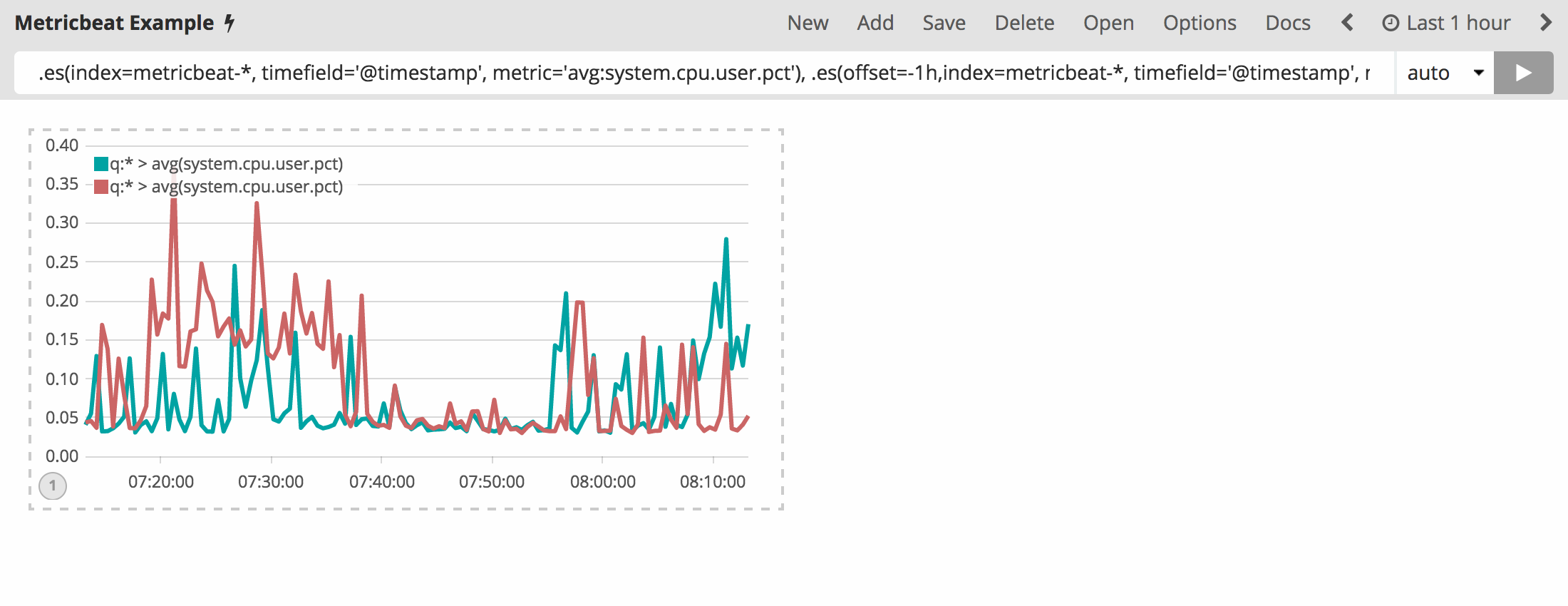
It is a bit hard to differentiate the two series. Customize the labels
to easily distinguish them. You can always append the .label()
function to any expression to add a custom label. Enter the below
expression into the Timelion query bar to customize your labels:
.es(offset=-1h,index=metricbeat-*, timefield='@timestamp', metric='avg:system.cpu.user.pct').label('last hour'), .es(index=metricbeat-*, timefield='@timestamp', metric='avg:system.cpu.user.pct').label('current hour')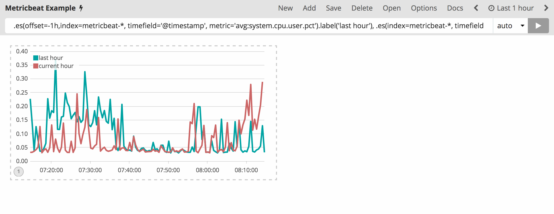
Save the entire Timelion sheet as Metricbeat Example. You should always save any significant changes made to this sheet as you progress through this tutorial.
Customize and format visualizations
Timelion has many options for customization. You can personalize nearly every aspect of a chart with the functions available. For this tutorial, you will perform the following modifications:
-
Add a title.
-
Change a series type.
-
Change the color and opacity of a series.
-
Modify the legend.
In the previous section, you created a Timelion chart with two series. Let’s continue to customize this visualization.
Before making any other modifications, append the title() function
to the end of an expression to add a title with a meaningful name. This
will make it much easier for unfamiliar users to understand the
visualizations purpose. For this example, add
title('CPU usage over time') to the original series. Use the
following expression in your Timelion query bar:
.es(offset=-1h,index=metricbeat-*, timefield='@timestamp', metric='avg:system.cpu.user.pct').label('last hour'), .es(index=metricbeat-*, timefield='@timestamp', metric='avg:system.cpu.user.pct').label('current hour').title('CPU usage over time')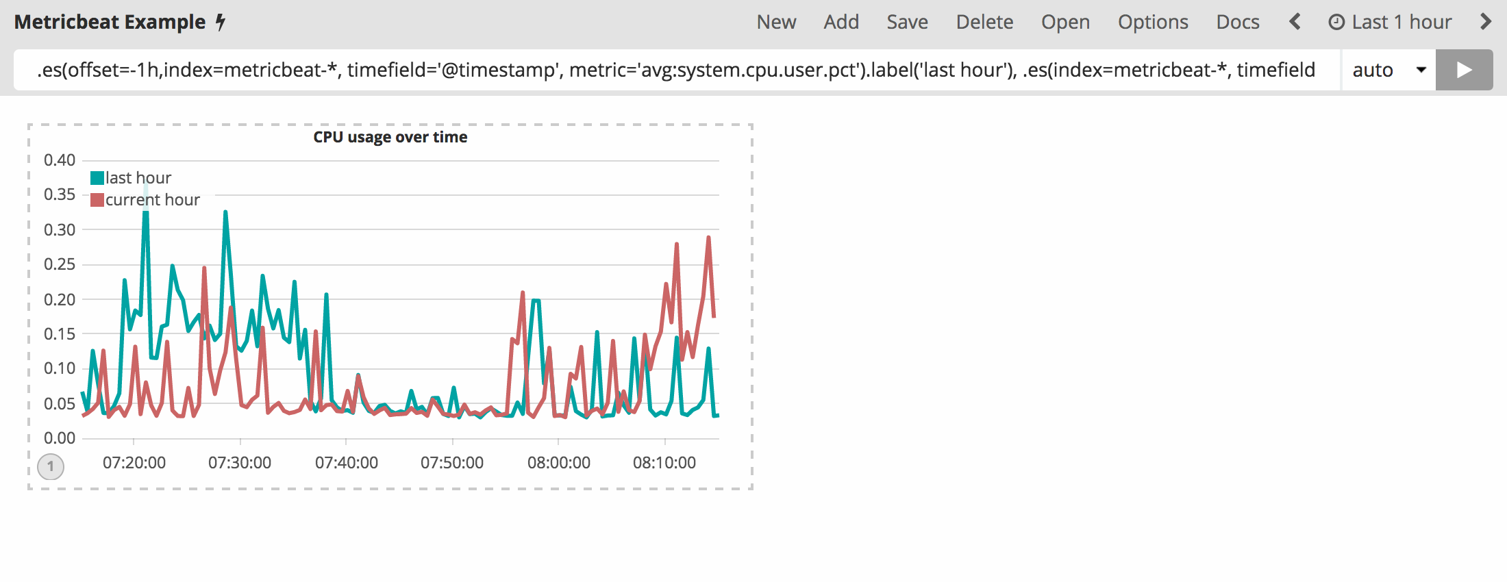
To differentiate the last hour series a bit more, you are going to
change the chart type to an area chart. In order do so, you must use the
.lines() function to customize the line chart. You will be setting
the fill and width arguments to set the fill of the line chart
and line width respectively. In this example, you will set the fill
level to 1 and the width of the border to 0.5 by appending
.lines(fill=1,width=0.5). Use the following expression in the
Timelion query bar:
.es(offset=-1h,index=metricbeat-*, timefield='@timestamp', metric='avg:system.cpu.user.pct').label('last hour').lines(fill=1,width=0.5), .es(index=metricbeat-*, timefield='@timestamp', metric='avg:system.cpu.user.pct').label('current hour').title('CPU usage over time')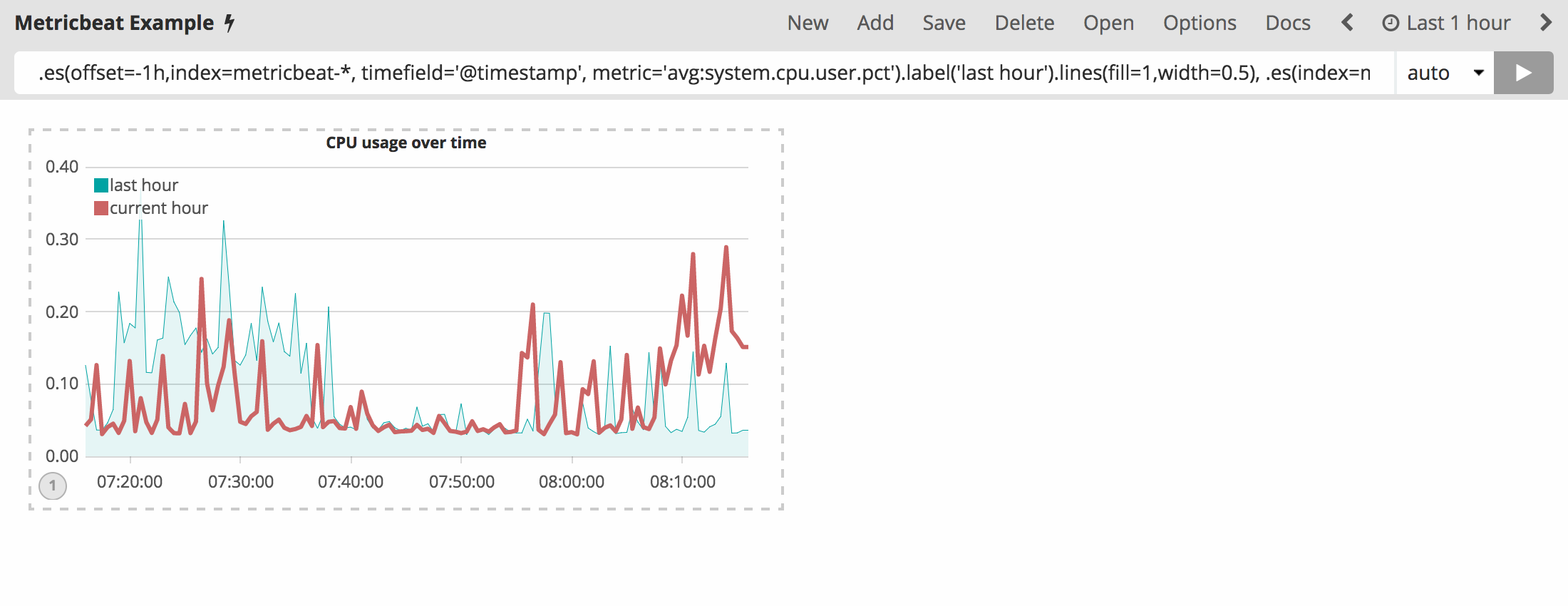
Let’s color these series so that the current hour series pops a bit more
than the last hour series. The color() function can be used to
change the color of any series and accepts standard color names,
hexadecimal values or a color schema for grouped series. For this
example you will use .color(gray) for the last hour and
.color(#1E90FF) for the current hour. Enter the following expression
into the Timelion query bar to make the adjustments:
.es(offset=-1h,index=metricbeat-*, timefield='@timestamp', metric='avg:system.cpu.user.pct').label('last hour').lines(fill=1,width=0.5).color(gray), .es(index=metricbeat-*, timefield='@timestamp', metric='avg:system.cpu.user.pct').label('current hour').title('CPU usage over time').color(#1E90FF)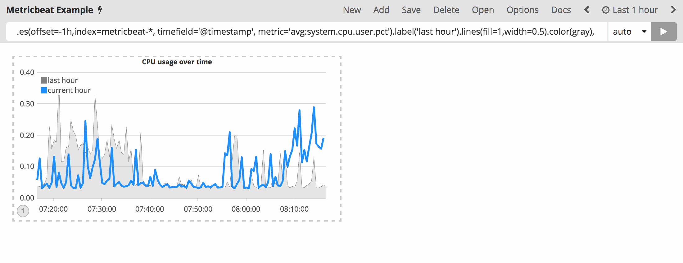
Last but not least, adjust the legend so that it takes up as little
space as possible. You can utilize the .legend() function to set the
position and style of the legend. For this example, place the legend in
the north-west position of the visualization with two columns by
appending .legend(columns=2, position=nw) to the original series.
Use the following expression to make the adjustments:
.es(offset=-1h,index=metricbeat-*, timefield='@timestamp', metric='avg:system.cpu.user.pct').label('last hour').lines(fill=1,width=0.5).color(gray), .es(index=metricbeat-*, timefield='@timestamp', metric='avg:system.cpu.user.pct').label('current hour').title('CPU usage over time').color(#1E90FF).legend(columns=2, position=nw)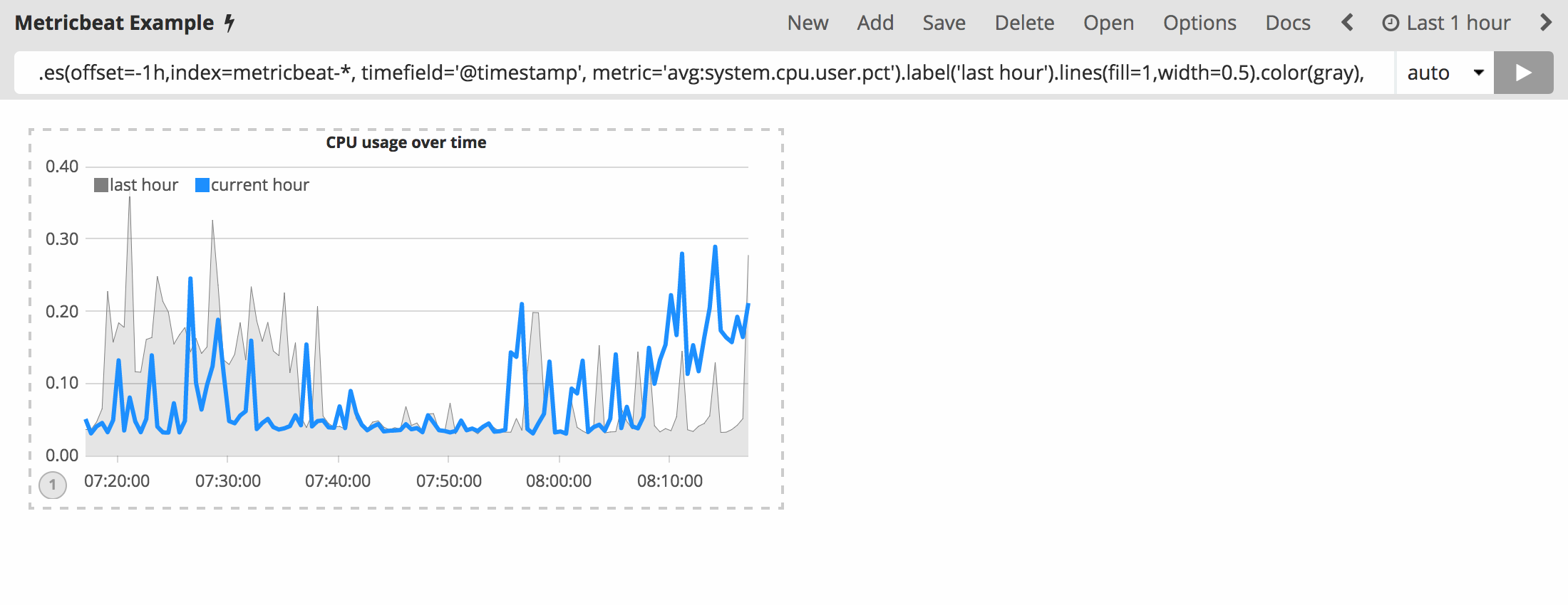
Save your changes and continue on to the next section to learn about mathematical functions.
Using mathematical functions
You have learned how to create and style a Timelion visualization in the previous two sections. This section will explore the mathematical functions Timelion offers. You will continue to use the Metricbeat data to create a new Timelion visualization for inbound and outbound network traffic. To start, you must add a new Timelion visualization to the sheet.
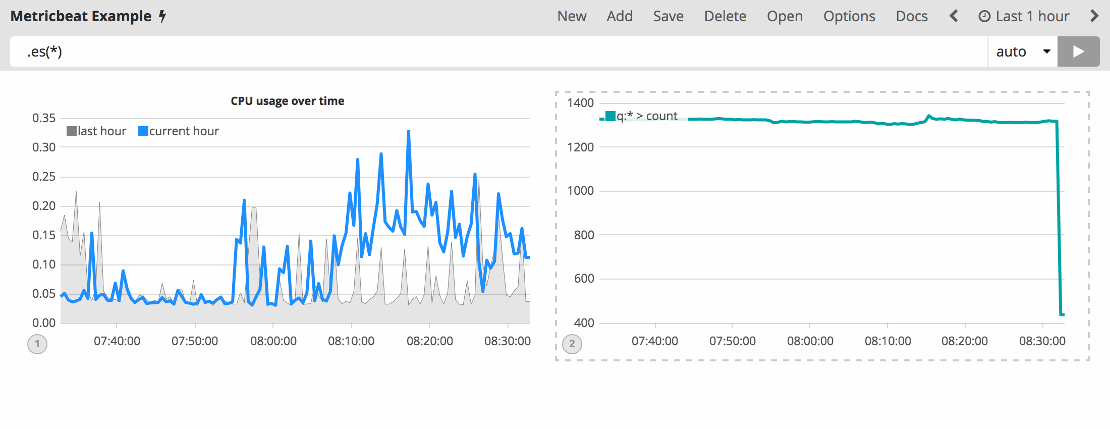
In the top menu, click Add to add a second visualization. When added
to the sheet, you will notice that the query bar has been replaced with
the default .es(*) expression. This is because the query is
associated with the visualization on the Timelion sheet you have
selected.
To start tracking the inbound / outbound network traffic, your first
expression will calculate the maximum value of
system.network.in.bytes. Enter the following expression into your
Timelion query bar:
.es(index=metricbeat*, timefield=@timestamp, metric=max:system.network.in.bytes)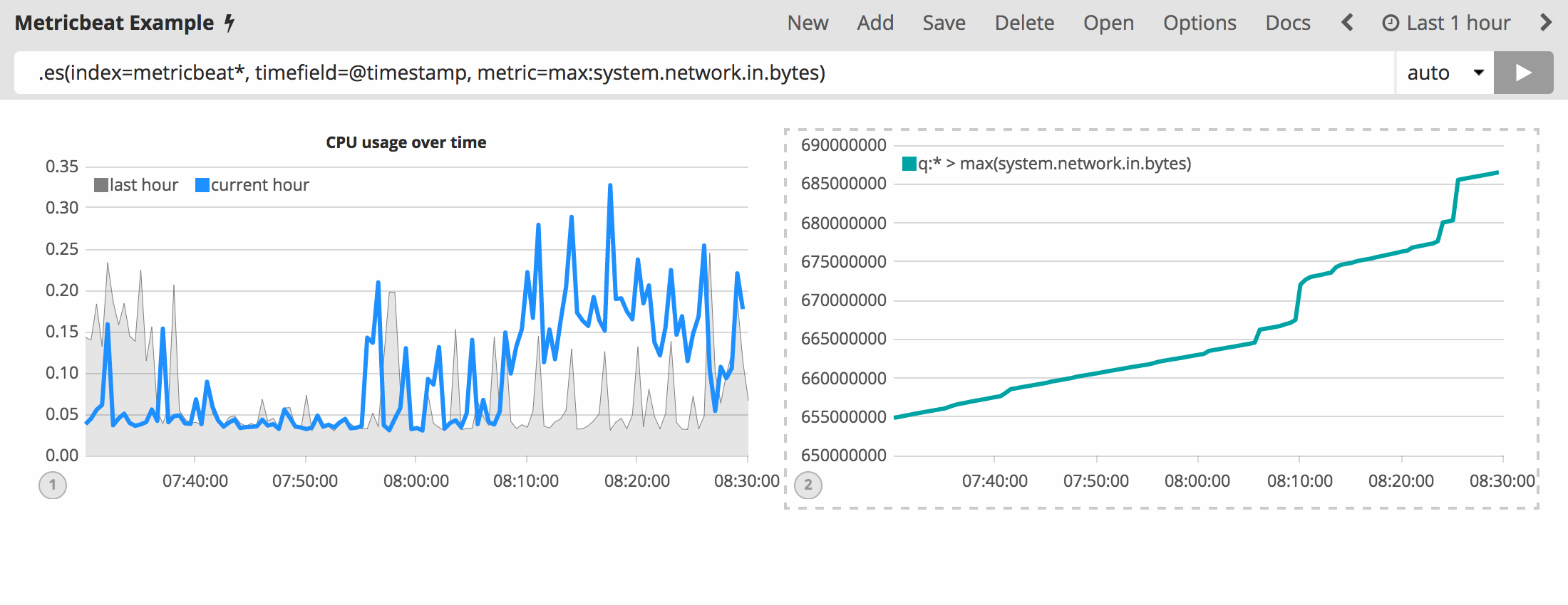
Monitoring network traffic is much more valuable when plotting the rate
of change. The derivative() function is used do just that - plot the
change in values over time. This can be easily done by appending the
.derivative() to the end of an expression. Use the following
expression to update your visualization:
.es(index=metricbeat*, timefield=@timestamp, metric=max:system.network.in.bytes).derivative()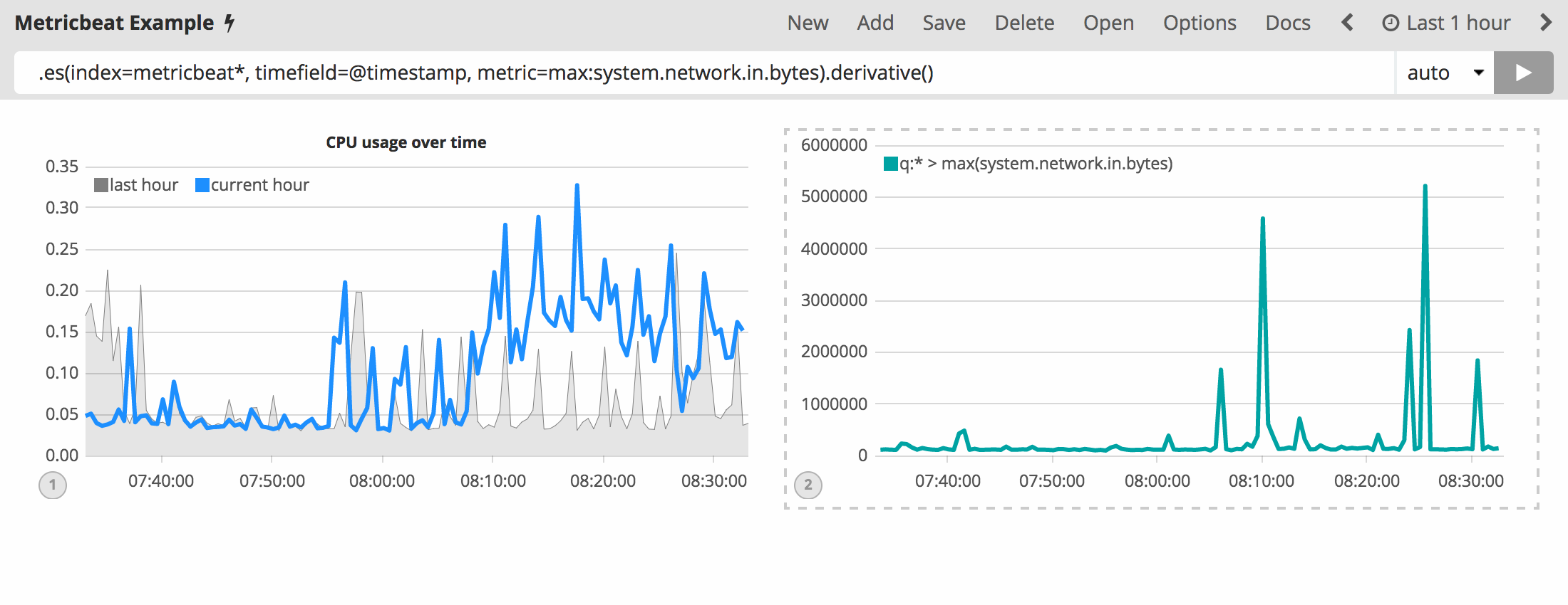
Now for the outbound traffic. You must add a similar calculation for
system.network.out.bytes. Because outbound traffic is leaving your
machine, it makes sense to represent this metric as a negative number.
The .multiply() function will multiply the series by a number, the
result of a series or a list of series. For this example, you will use
.multiply(-1) to convert the outbound network traffic to a negative
value. Use the following expression to update your visualization:
.es(index=metricbeat*, timefield=@timestamp, metric=max:system.network.in.bytes).derivative(), .es(index=metricbeat*, timefield=@timestamp, metric=max:system.network.out.bytes).derivative().multiply(-1)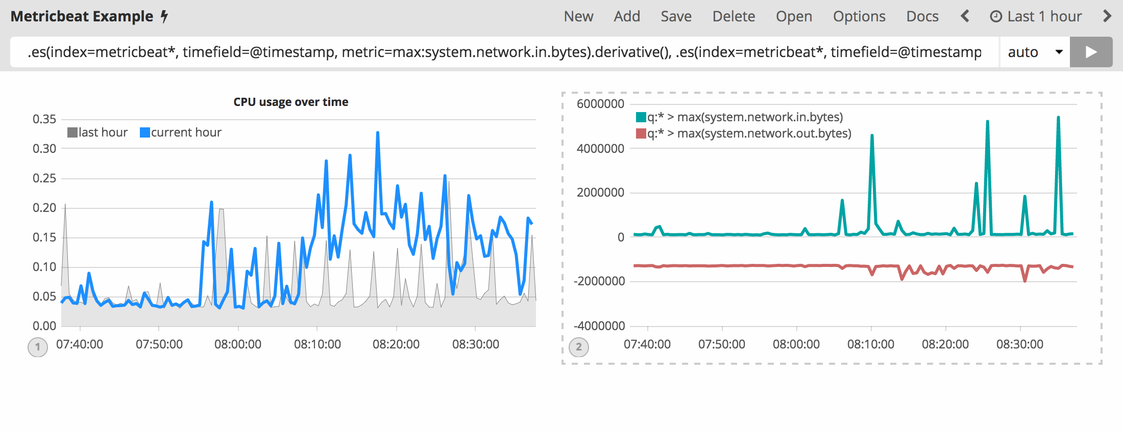
To make this visualization a bit easier to consume, convert the series
from bytes to megabytes. Timelion has a .divide() function that can
be used. .divide() accepts the same input as .multiply() and
will divide the series by the divisor defined. Use the following
expression to update your visualization:
.es(index=metricbeat*, timefield=@timestamp, metric=max:system.network.in.bytes).derivative().divide(1048576), .es(index=metricbeat*, timefield=@timestamp, metric=max:system.network.out.bytes).derivative().multiply(-1).divide(1048576)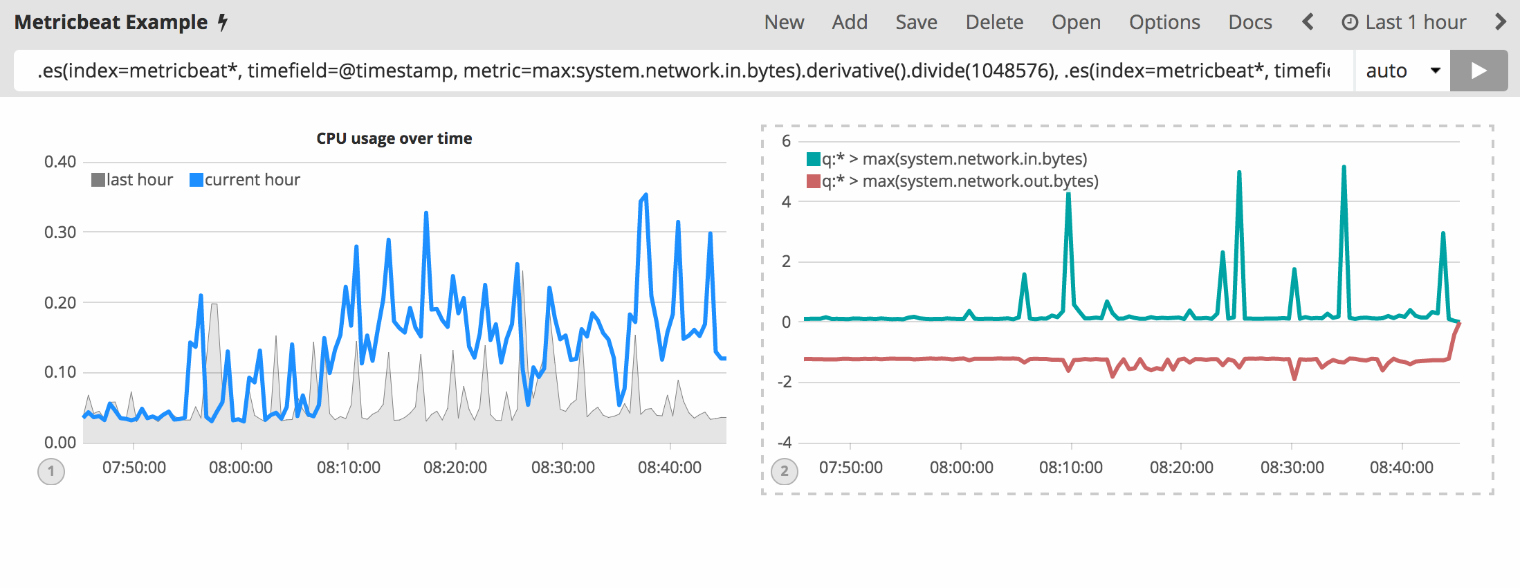
Utilizing the formatting functions .title(), .label(),
.color(), .lines() and .legend() learned in
the last section, let’s
clean up the visualization a bit. Use the following expression to update
your visualization:
.es(index=metricbeat*, timefield=@timestamp, metric=max:system.network.in.bytes).derivative().divide(1048576).lines(fill=2, width=1).color(green).label("Inbound traffic").title("Network traffic (MB/s)"), .es(index=metricbeat*, timefield=@timestamp, metric=max:system.network.out.bytes).derivative().multiply(-1).divide(1048576).lines(fill=2, width=1).color(blue).label("Outbound traffic").legend(columns=2, position=nw)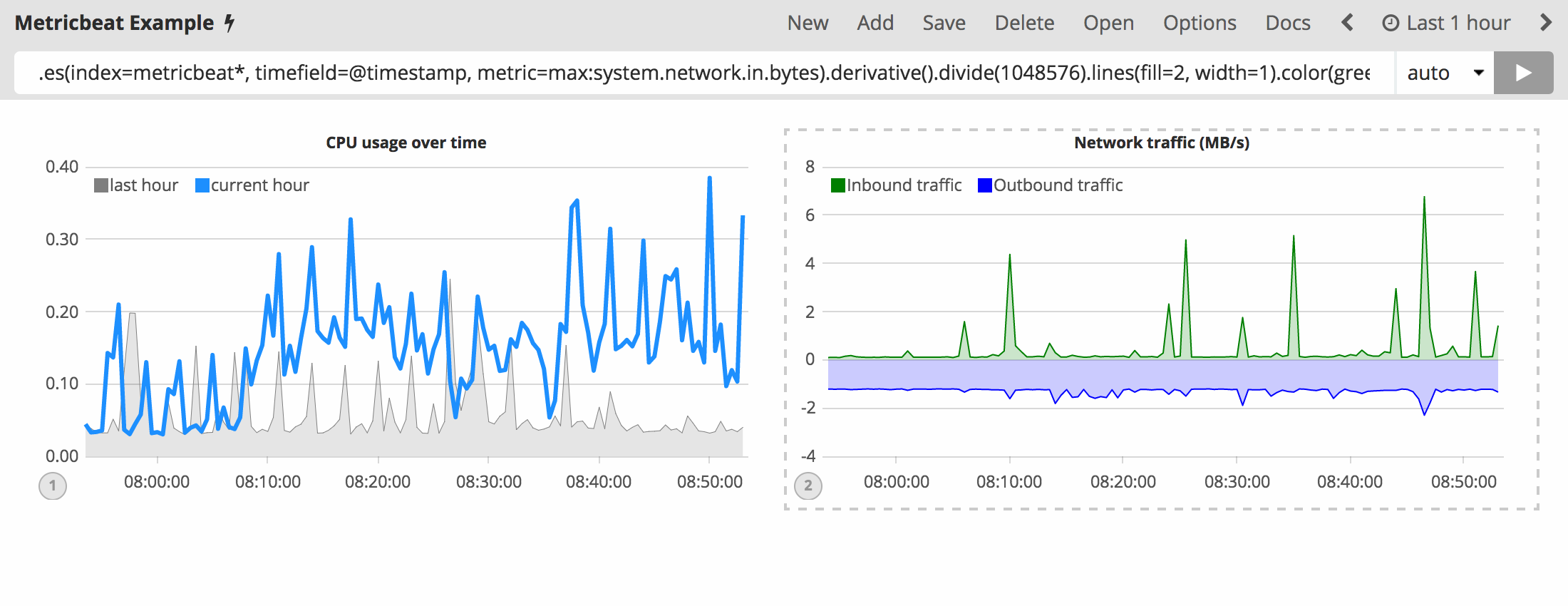
Save your changes and continue on to the next section to learn about conditional logic and tracking trends.
Using conditional logic and tracking trends
In this section you will learn how to modify time series data with conditional logic and create a trend with a moving average. This is helpful to easily detect outliers and patterns over time.
For the purposes of this tutorial, you will continue to use
Metricbeat data to
add another visualization that monitors memory consumption. To start,
use the following expression to chart the maximum value of
system.memory.actual.used.bytes.
.es(index=metricbeat-*, timefield='@timestamp', metric='max:system.memory.actual.used.bytes')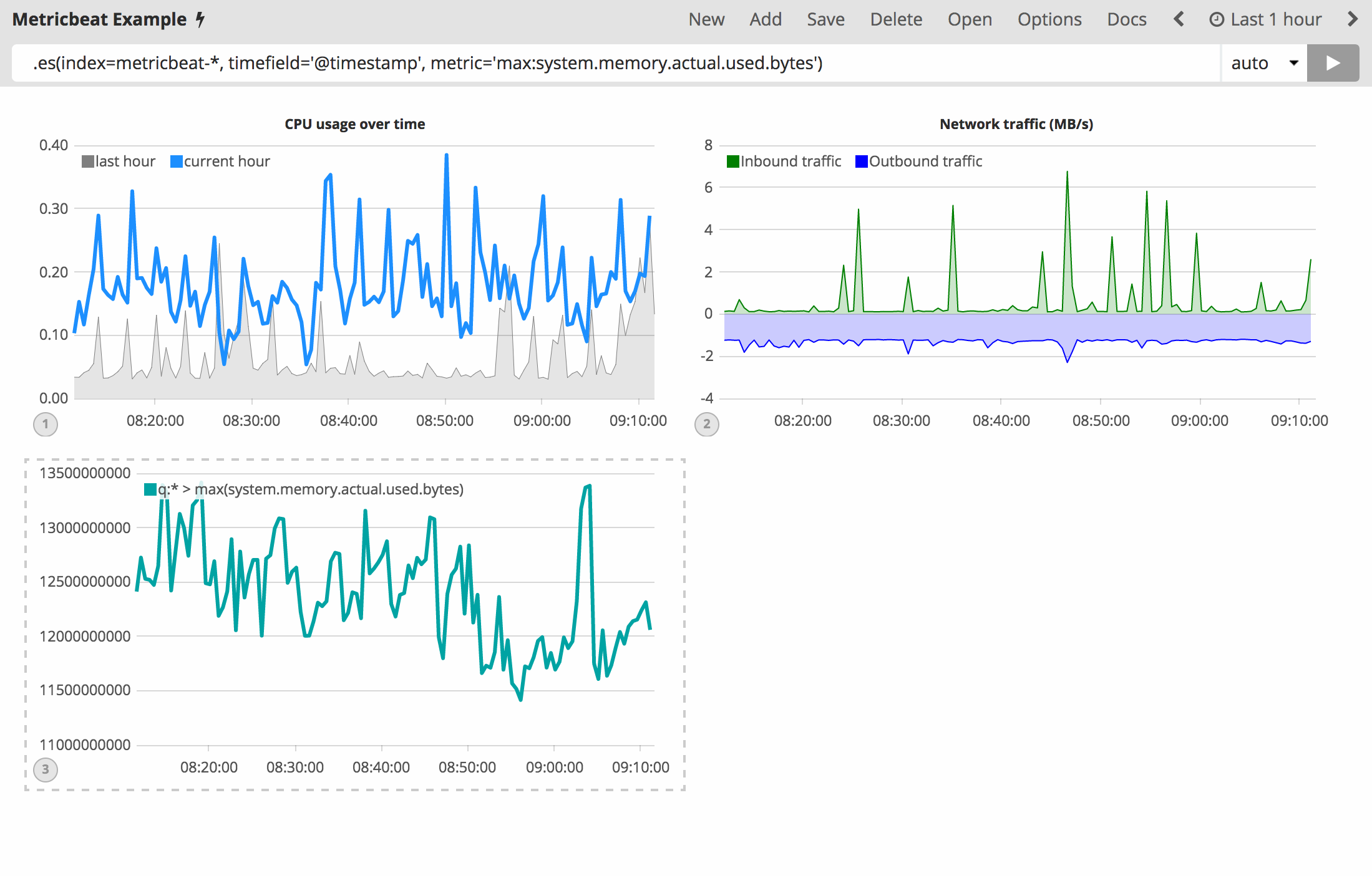
Let’s create two thresholds to keep an eye on the amount of used memory. For the purposes of this tutorial, your warning threshold will be 12.5GB and your severe threshold will be 15GB. When the maximum amount of used memory exceeds either of these thresholds, the series will be colored accordingly.
| If the threshold values are too high or low for your machine, adjust accordingly. |
To configure these two threshold values, you can utilize Timelion’s
conditional logic. In this tutorial you will use if() to compare
each point to a number, adjust the styling if the condition evaluates to
true and use the default styling if the condition evaluates to
false. Timelion offers the following six operator values for
comparison.
|
equal |
|
not equal |
|
less than |
|
less than or equal to |
|
greater than |
|
greater than or equal to |
Because there are two thresholds, it makes sense to style them
differently. Use the gt operator to color the warning threshold
yellow with .color('#FFCC11') and the severe threshold red with
.color('red'). Enter the following expression into the Timelion
query bar to apply the conditional logic and threshold styling:
.es(index=metricbeat-*, timefield='@timestamp', metric='max:system.memory.actual.used.bytes'), .es(index=metricbeat-*, timefield='@timestamp', metric='max:system.memory.actual.used.bytes').if(gt,12500000000,.es(index=metricbeat-*, timefield='@timestamp', metric='max:system.memory.actual.used.bytes'),null).label('warning').color('#FFCC11'), .es(index=metricbeat-*, timefield='@timestamp', metric='max:system.memory.actual.used.bytes').if(gt,15000000000,.es(index=metricbeat-*, timefield='@timestamp', metric='max:system.memory.actual.used.bytes'),null).label('severe').color('red')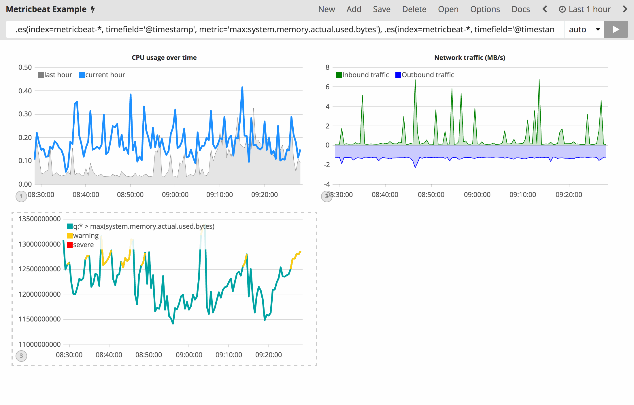
For additional information on Timelion’s conditional capabilities, check out the blog post I have but one .condition().
Now that you have thresholds defined to easily identify outliers, let’s
create a new series to determine what the trend really is. Timelion’s
mvavg() function enables you to calculate the moving average over a
given window. This is especially helpful for noisy time series. For this
tutorial, you will use .mvavg(10) to create a moving average with a
window of 10 data points. Use the following expression to create a
moving average of the maximum memory usage:
.es(index=metricbeat-*, timefield='@timestamp', metric='max:system.memory.actual.used.bytes'), .es(index=metricbeat-*, timefield='@timestamp', metric='max:system.memory.actual.used.bytes').if(gt,12500000000,.es(index=metricbeat-*, timefield='@timestamp', metric='max:system.memory.actual.used.bytes'),null).label('warning').color('#FFCC11'), .es(index=metricbeat-*, timefield='@timestamp', metric='max:system.memory.actual.used.bytes').if(gt,15000000000,.es(index=metricbeat-*, timefield='@timestamp', metric='max:system.memory.actual.used.bytes'),null).label('severe').color('red'), .es(index=metricbeat-*, timefield='@timestamp', metric='max:system.memory.actual.used.bytes').mvavg(10)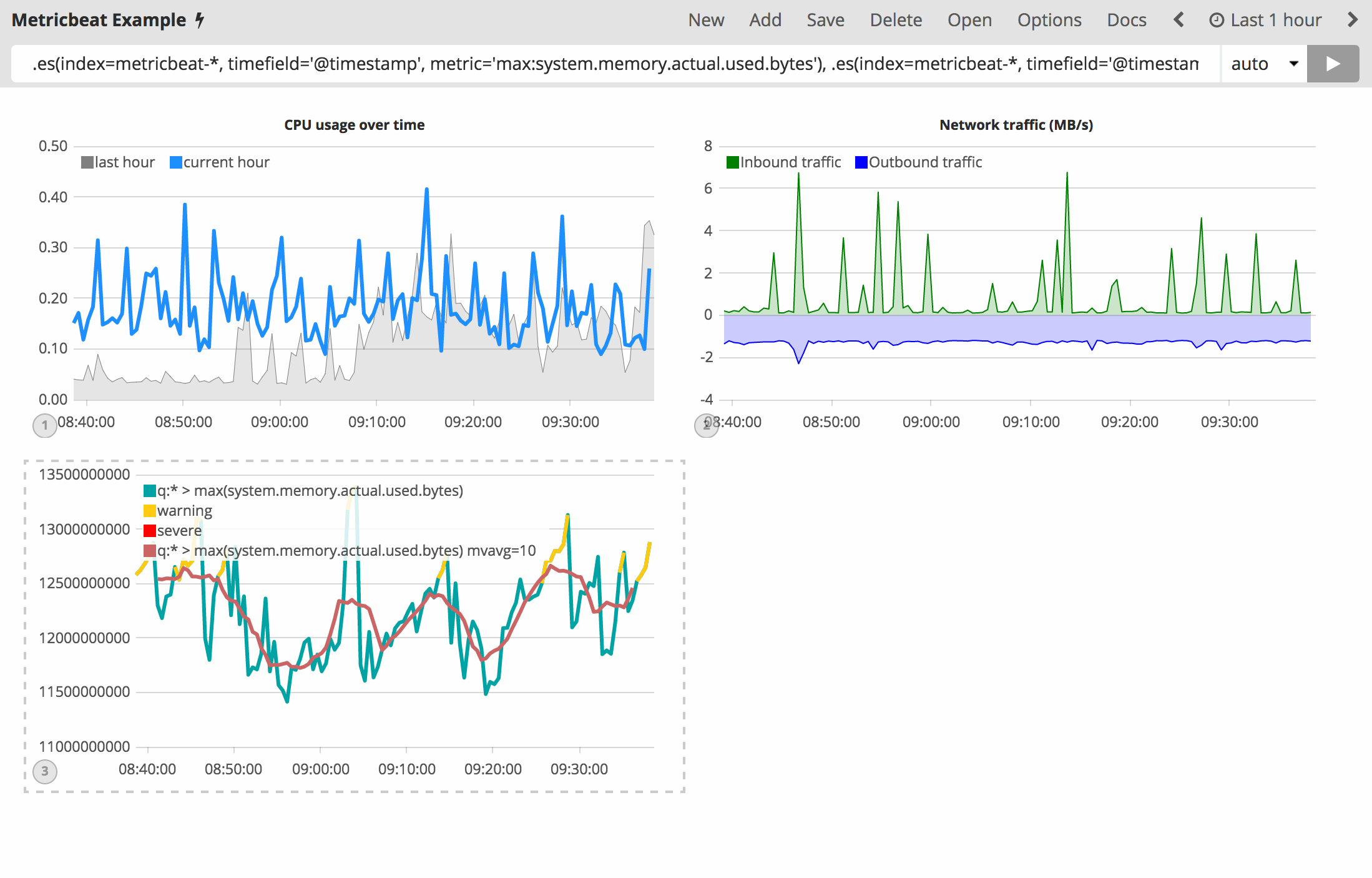
Now that you have thresholds and a moving average, let’s format the
visualization so it is a bit easier to consume. As with the last
section, use the .color(), .line(), .title() and
.legend() functions to update your visualization accordingly:
.es(index=metricbeat-*, timefield='@timestamp', metric='max:system.memory.actual.used.bytes').label('max memory').title('Memory consumption over time'), .es(index=metricbeat-*, timefield='@timestamp', metric='max:system.memory.actual.used.bytes').if(gt,12500000000,.es(index=metricbeat-*, timefield='@timestamp', metric='max:system.memory.actual.used.bytes'),null).label('warning').color('#FFCC11').lines(width=5), .es(index=metricbeat-*, timefield='@timestamp', metric='max:system.memory.actual.used.bytes').if(gt,15000000000,.es(index=metricbeat-*, timefield='@timestamp', metric='max:system.memory.actual.used.bytes'),null).label('severe').color('red').lines(width=5), .es(index=metricbeat-*, timefield='@timestamp', metric='max:system.memory.actual.used.bytes').mvavg(10).label('mvavg').lines(width=2).color(#5E5E5E).legend(columns=4, position=nw)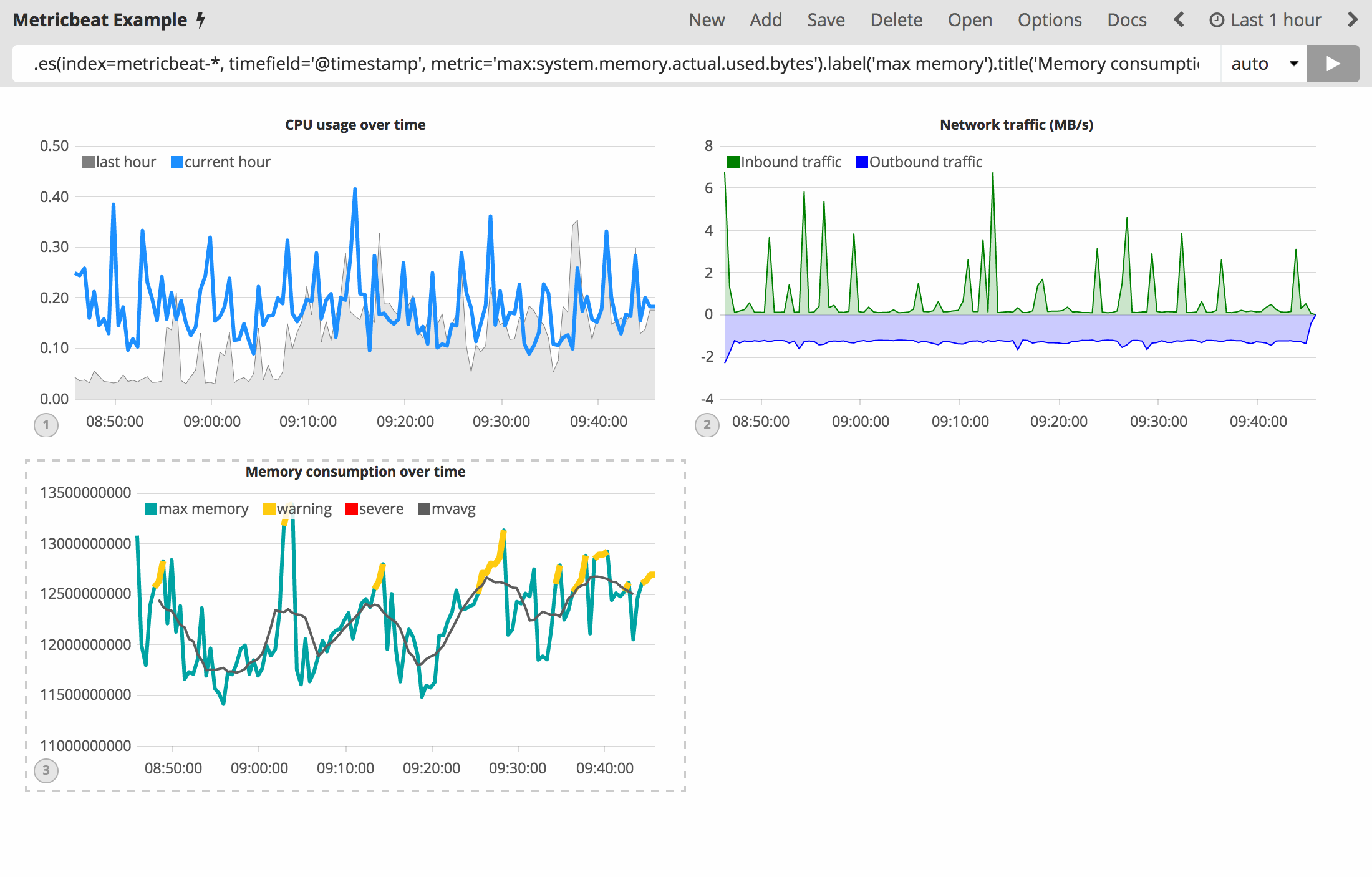
Save your Timelion sheet and continue on to the next section to add these new visualizations to your dashboard.
Add to dashboard
You have officially harnessed the power of Timelion to create time series visualizations. The final step of this tutorial is to add your new visualizations to a dashboard. This section will show you how to save a visualization from your Timelion sheet and add it to an existing dashboard.
To save a Timelion visualization as a dashboard panel:
-
Select the visualization you would like to add to one (or multiple) dashboards.
-
Click the
Saveoption in the top menu. -
Select
Save current expression as Kibana dashboard panel. -
Name your panel and click
Saveto save as a dashboard visualization.
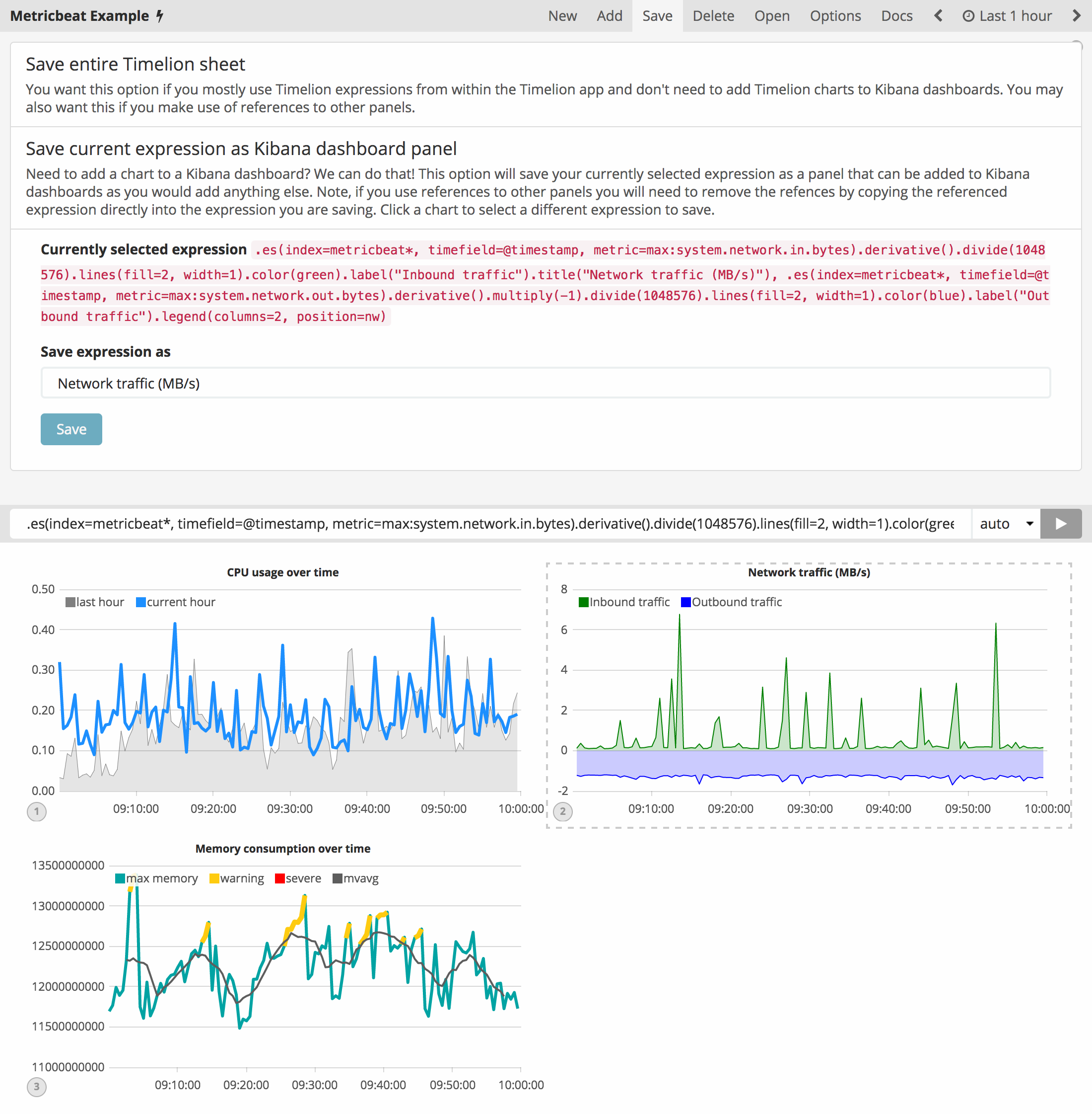
Now you can add this dashboard panel to any dashboard you would like. This visualization will now be listed in the Visualize list. Go ahead and follow the same process for the rest of the visualizations you created.
Create a new dashboard or open an existing one to add the Timelion visualizations as you would any other visualization.
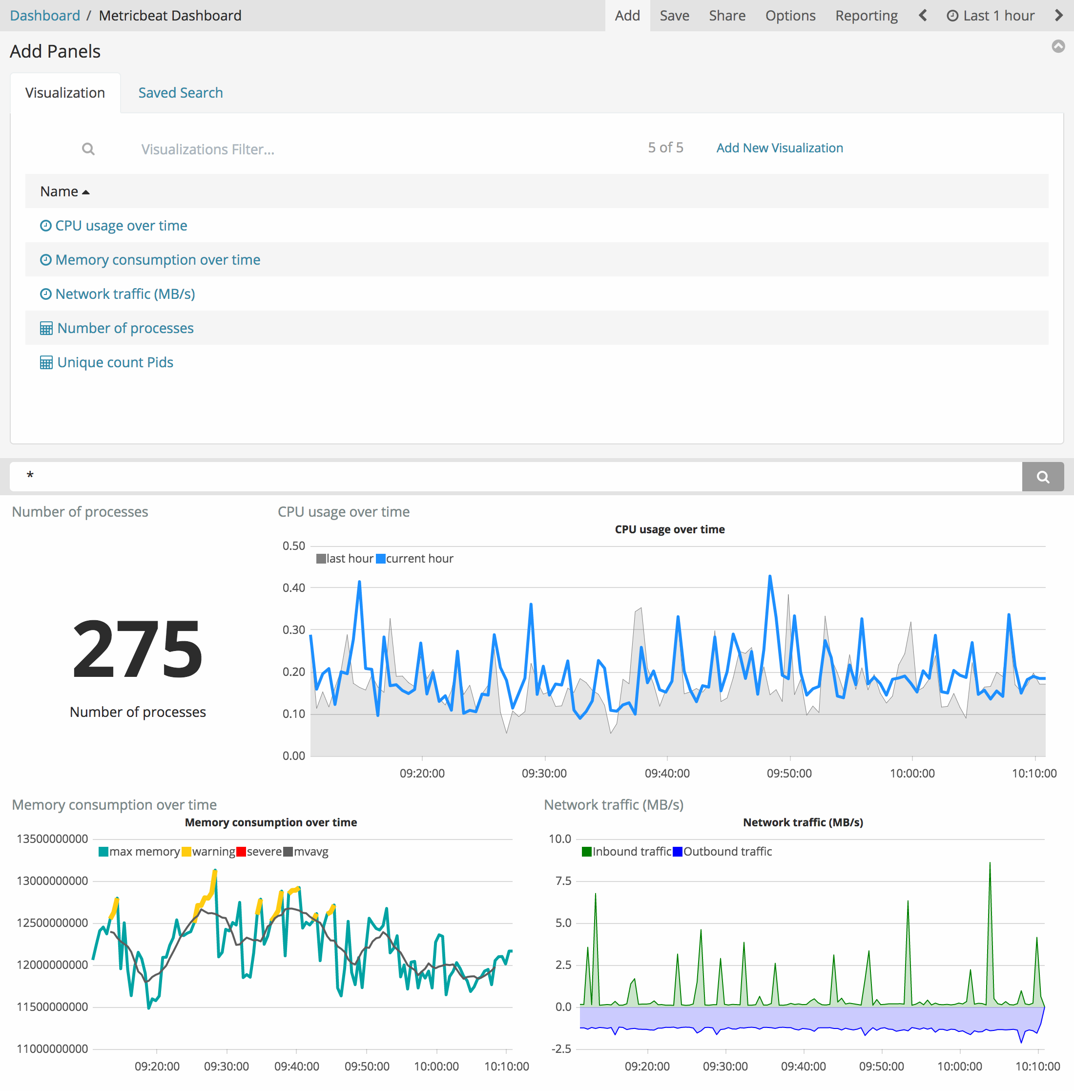
| You can also create time series visualizations from the Visualize page. Select the time series visualization type and enter a Timelion expression in the expression field. |
Timelion online help and documentation
If you cannot remember a function, or if searching for a new function, Timelion has its own built-in online help and documentation.
Click Docs in the top menu to view the available functions and access the inline reference. As you start to enter functions in the query bar, Timelion displays the relevant arguments in real time.
