Scatter Plot
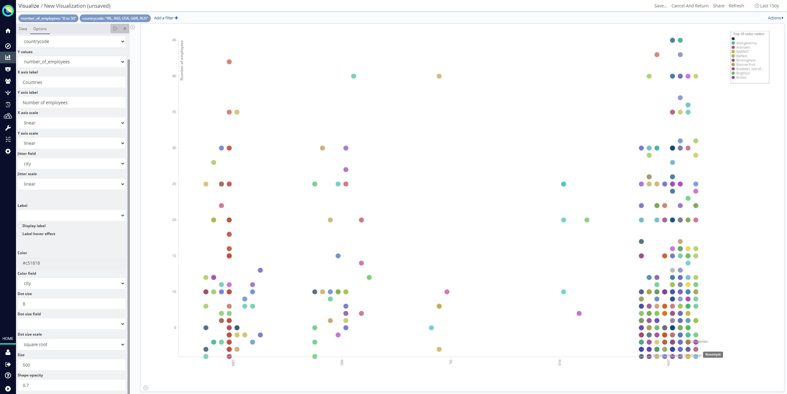
This visualization displays a scatter plot chart in four different modes: Straight, Significant terms, Any aggregator, Filtered aggregator.
Straight

This mode does not use aggregates, it pulls the data directly from Elasticsearch using the Random scoring method to get a random sample of records.
-
X values: The value can be String, Date or Numeric.
-
Y values: The field value can be String, Date or Numeric.
-
X axis label
-
Y axis label
-
X axis scale: Select linear, log, or square root scales for the chart’s X axis. You can use a log scale to display data that varies exponentially, such as a compounding interest chart, or a square root scale to regularize the display of highly variable data sets. This kind of data, where the variability is itself variable over the domain being examined, is known as heteroscedastic data. For example, if a data set of height versus weight has a relatively narrow range of variability at the short end of height, but a wider range at the taller end, the data set is heteroscedastic.
-
Y axis scale: Select linear, log, or square root scales for the chart’s Y axis.
-
Jitter field: Deterministic jitter to add pseudo random data distribution in the X axis data interval. Jitter is useful for distributing the values across X axis. Doing so enables you to show the data distributed across the bucket, in that way the dot is more visible.
-
Jitter scale: Select linear, log, or square root scales for the jitter.
-
Label: Dot label.
-
Display label: Select this check box to enable the display of a label next to the dot.
-
Label hover effect: Select this check box to enable the tool tip label.
-
-
Color: Dot color.
-
Color field: Used as an input to generate the dot colors. Only number field types are permitted.
-
Dot size
-
Dot size field: An input for the dot size. Only number field types are permitted.
-
Dot size scale: Select linear, log, or square root scales for the dot size.
-
Size: Number of random records to fetch from an Elasticsearch query.
-
Shape opacity: Value from 0 to 1 that defines the dot transparency.
Significant terms

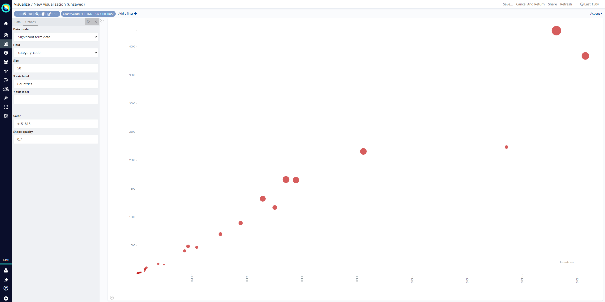
In this mode the chart is built from a Significant terms aggregation query result. The X values are taken from the bg_count field and the Y values from doc_count field.
-
Field: Field that will provide terms to be aggregated.
-
Size: Number of significant terms to be aggregated.
-
X axis label
-
Y axis label
-
Color: Dot color.
-
Shape opacity: Value from 0 to 1 that defines the dot transparency.
Any aggregator

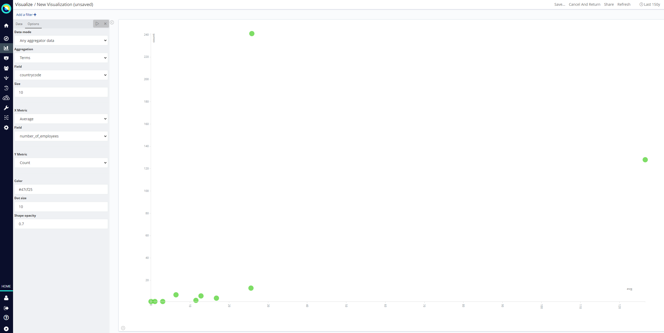
The chart is built from a Date Histogram, Histogram, Terms or Significant terms aggregation query result.
-
Aggregation
-
X Metric: Metric for X axis values.
-
Y Metric: Metric for Y axis values.
-
Color: Dot color.
-
Dot size
-
Shape opacity: Value from 0 to 1 that defines the dot transparency.
Filtered aggregator

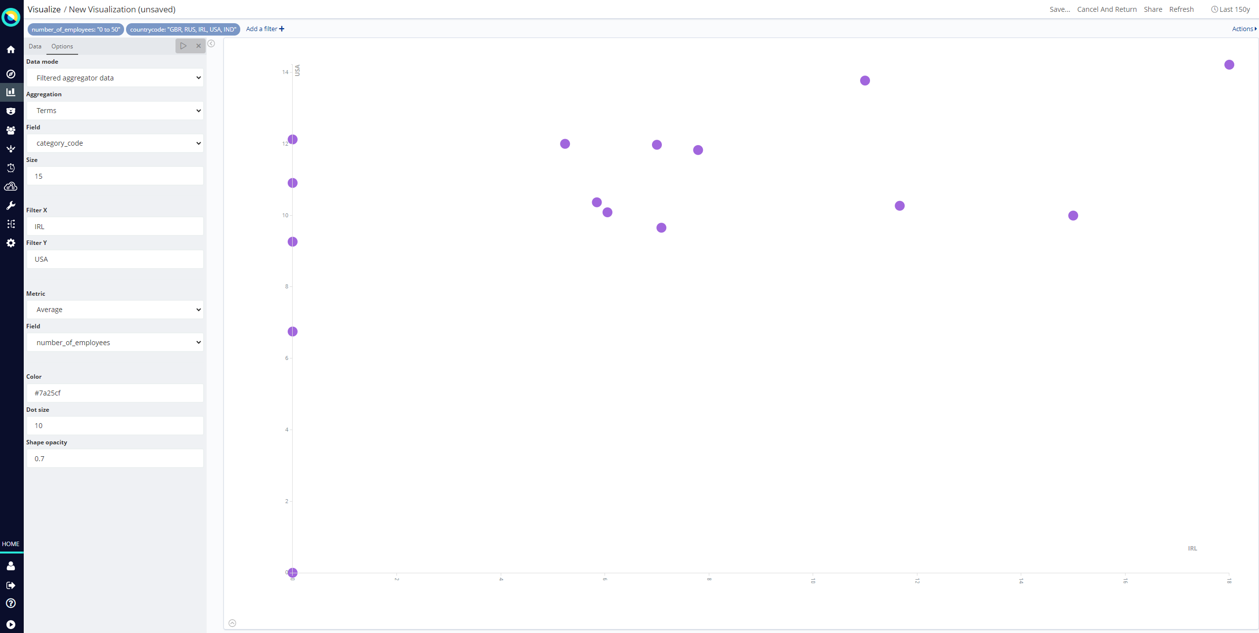
The chart is built from a Date Histogram, Histogram, Terms or Significant terms aggregation query result. The X and Y values are taken from Filters aggregation results.
-
Aggregation
-
Filter X: X axis filter string.
-
Filter Y: Y axis filter string.
-
Metric: Metric to be calculated for each filter aggregation.
-
Color: Dot color.
-
Dot size
-
Shape opacity: Value from 0 to 1 that defines the dot transparency.
After changing options, click Apply changes to update your visualization. Alternatively, click Discard changes to return your visualization to its previous state.