Parallel Lines chart
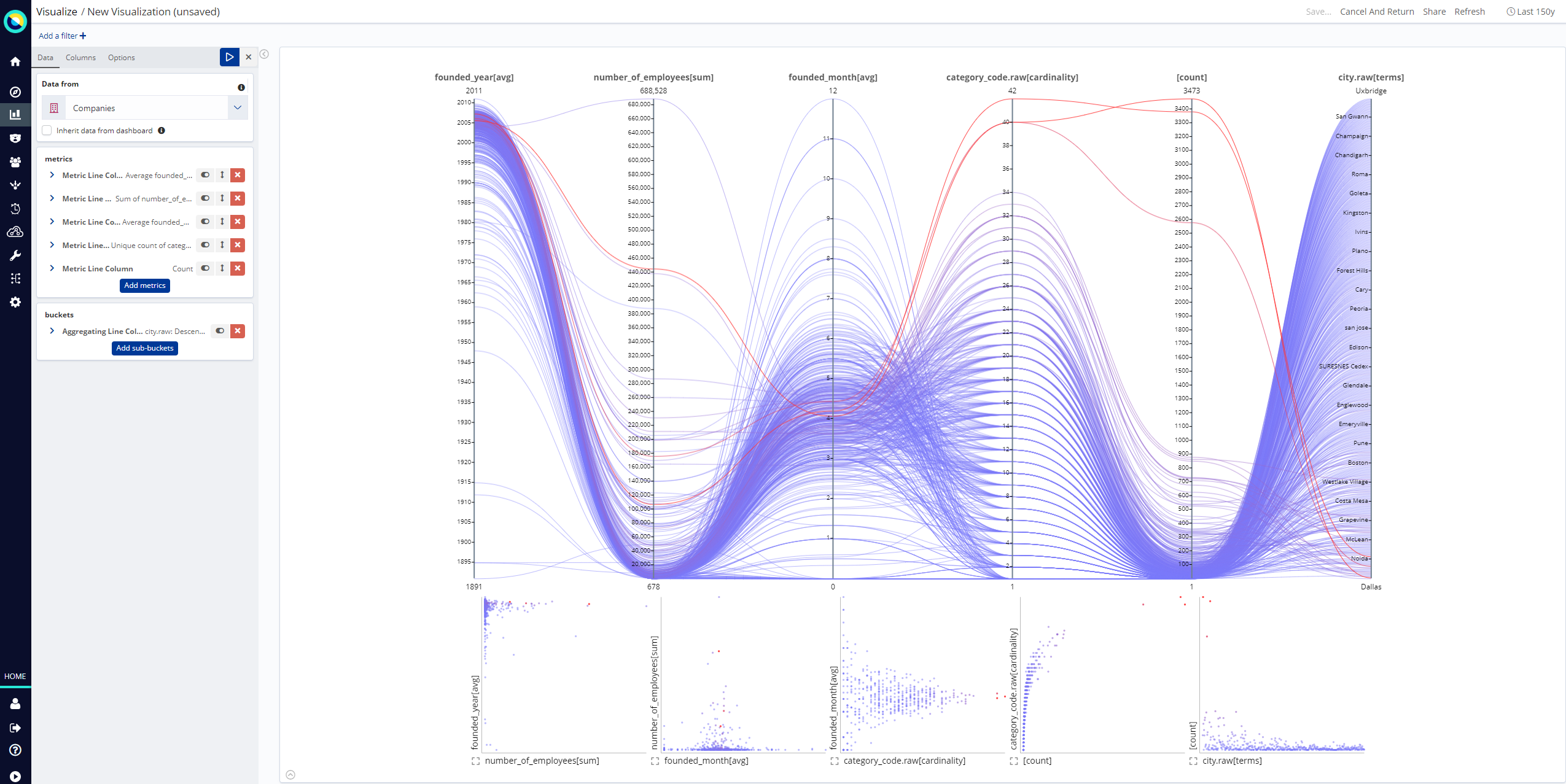
A parallel lines chart is a type of chart that is well suited for visualizing many data dimensions at the same type. This is unlike most classical chart types, which are only able to represent data along two coordinate axis, with possibly additional dimensions mapping to size and color of the plotted primitives.
To show an arbitrary number of dimensions, the parallel lines chart establishes one parallel axis per dimension, and lets a data-point be represented as a line passing through each axis at its corresponding value.
In addition to the classical parallel coordinates chart, this plugin also synchronizes a strip of minified scatterplots between each consecutive pair of axis, which is helpful to provide a more traditional reference for the represented data.

Interaction
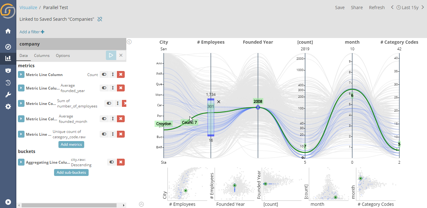
Hovering the mouse pointer over the chart highlights the nearest line or bucket of the dataset, displaying the associated values for each axis and the number of documents associated with the line.
Filtering lines
Clicking and dragging on columns enables you to define a filter for the values of a column. This means that all values outside the defined range are dimmed and unselectable. It is also possible to click a single value of a column, thus placing a filter on the single value itself, instead of a range of values.
Filters can also be defined on the minified scatterplots by clicking and dragging to a rectangle shape. This places two range filters on the axis columns.

Column interactions
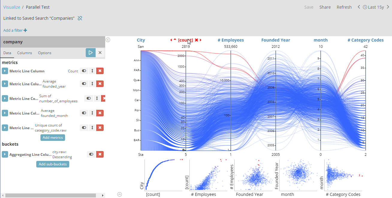
The main feature of the parallel lines chart is that it enables you to easily identify obvious cases of positive or negative correlation.
You can swap the placement of columns by clicking a column name and dragging the column to its new place. This immediately updates the chart and the scatterplots strip.

Columns can be sorted using the associated arrows available before a column name when you hover the mouse pointer over it. Sorting a columns does not perform an additional server request, it only sorts the already retrieved data.
Clicking the Remove icon (X) after a column name hides the column
from the visualization. This is useful when you want to concentrate on
the other columns. Hidden columns can be restored by clicking the Show
icon ( ) on the top-right corner of
the visualization (displayed only when a column is hidden).
Setting up
Data tab
Each metrics and buckets aggregation map to a column of the chart.
To change the name on top of the visualized axis, use the Custom Label value of the associated aggregation.
Columns tab
This tab displays additional configurable parameters associated to each column or axis of the chart. Currently, this is limited to:
Scale Type: Defines the type of scale to associate to an axis for numeric fields. Choices are linear, log or square root.
Options tab
Other general options that configure the appearance of the generated visualization:
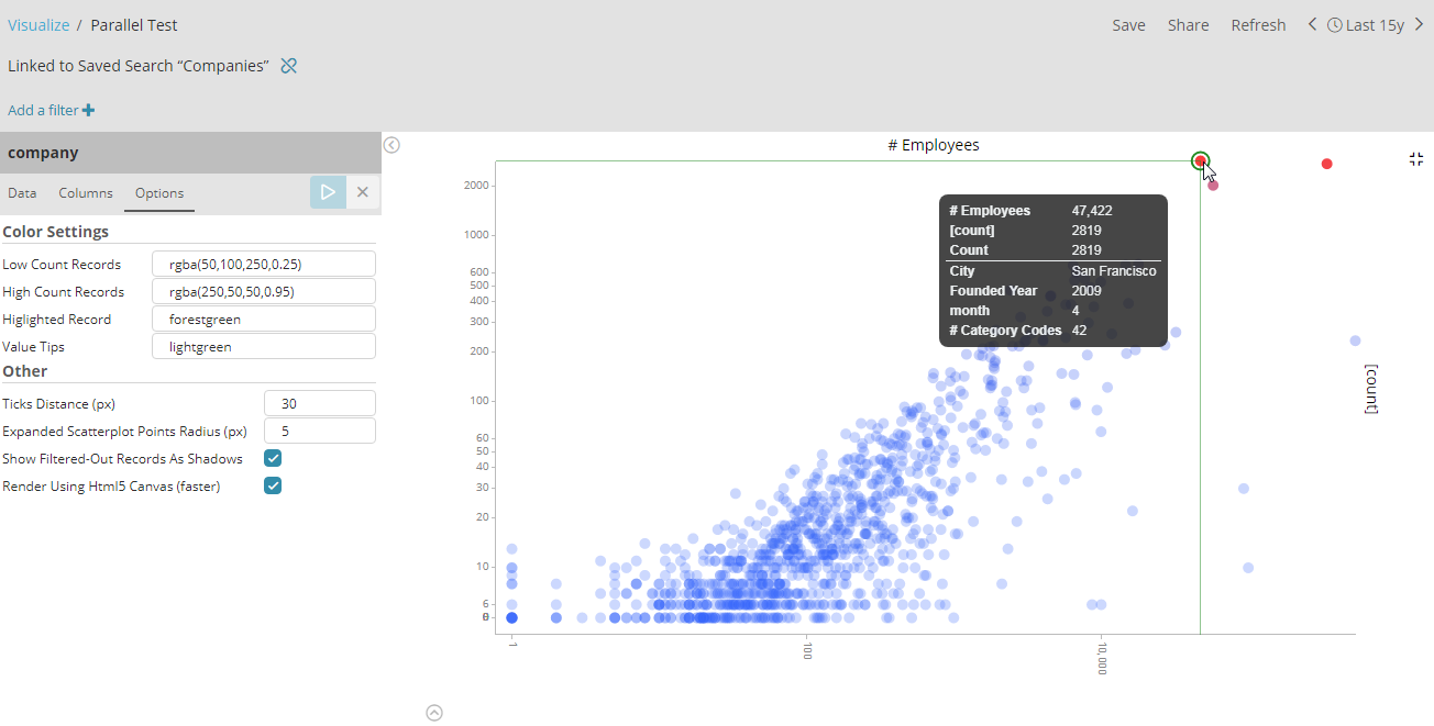
Color settings
-
Low Color Records: The color to be used for buckets (lines) with the lowest number of documents. The color of higher-documents buckets will be linearly interpolated from this value.
-
High Color Records: The color to be used for buckets (lines) with the highest number of documents. The color of lower-documents buckets will be linearly interpolated to this value.
-
Highlighted Record: The nearest line/bucket to the user’s mouse pointer will be highlighted with this color.
-
Value Tips: The color used to render the values of each axis/field near the highlighted line.
Other
-
Ticks Distance (px): The desired distance, in pixels, between the ticks of each axis. The actual distance is usually respected, depending on the cooperation of the scale associated to each axis.
-
Expanded Scatterplot Points Radius (px): The radius of data-points displayed in the expanded scatterplot (click on the expand icon when hovering a minified scatterplot to expand it)
-
Show Filtered-Out Records As Shadows: Whether lines outside currently defined column filters should be hidden or displayed with as gray 'shadow' lines.
-
Render Using Html5 Canvas (faster): A mostly technical detail, defines the kind of rendering to be used for lines (canvas or svg). Will be probably removed in future revisions.
