Boxplot chart
Boxplot charts give a good graphical image of the concentration of data. In Siren Investigate, you can create a boxplot chart from the numeric data in a set of Elasticsearch documents.
A boxplot is constructed from the following five values:
-
The minimum value;
-
The first quartile;
-
The median;
-
The third quartile; and
-
The maximum value.
These values are used for comparison purposes: You can compare how close other data values are to them.
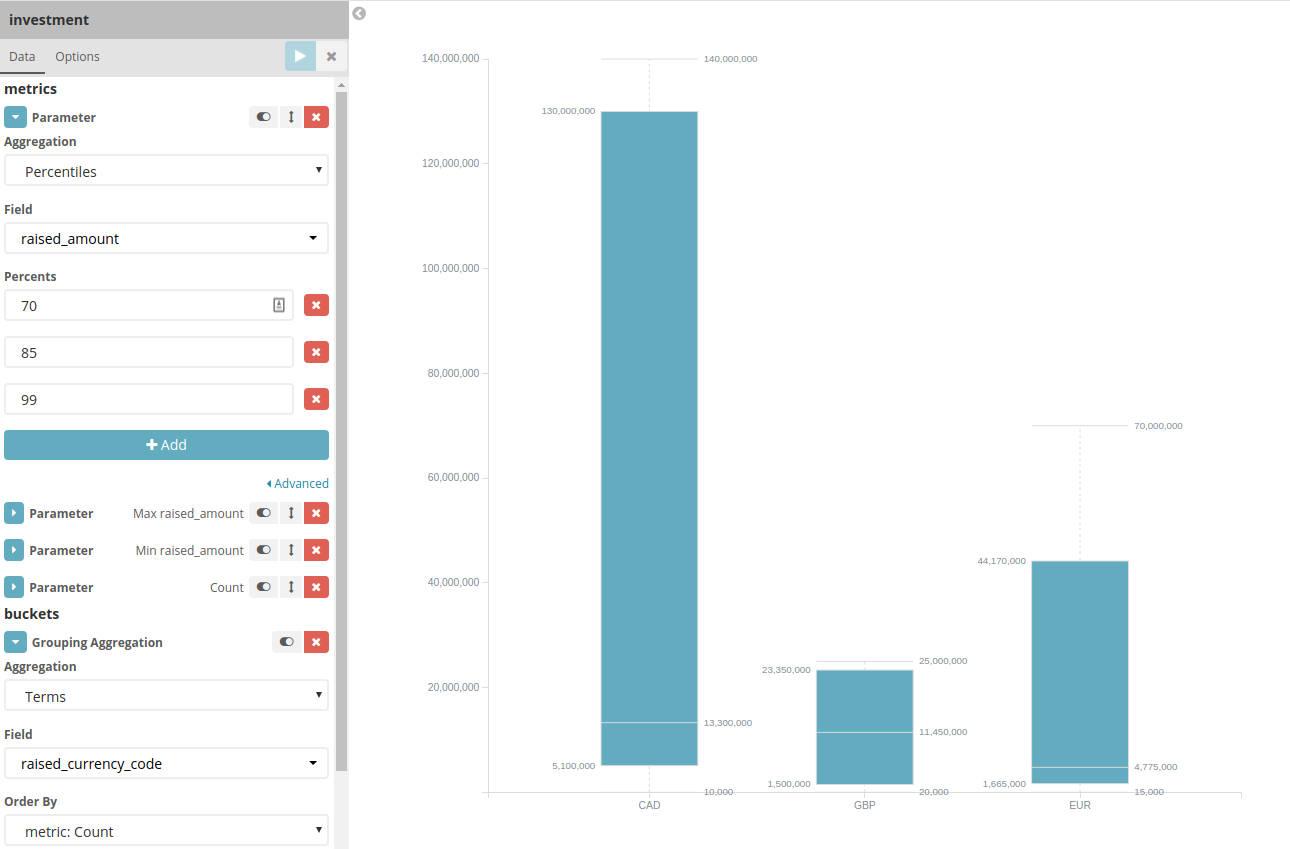
For example, you might want to chart and analyze the amount of money that was invested in a company in different currencies.
Creating a boxplot chart
Before you begin
To create a boxplot chart, the following data metrics are required:
-
One Percentiles metric that contains three defined percentiles:
-
Bottom percentile (usually around 25%)
-
Median (usually around 50%)
-
Top percentile (usually around 75%)
-
-
One Min metric
-
One Max metric
The following data metrics are optional:
-
One Count metric
-
One Aggregation (bucket)
-
One Sub Aggregation (bucket)
Procedure
-
In the sidebar navigation menu, click Visualize→Create visualization.
-
Under the Charts section, select Boxplot Chart from the list of available visualizations.
-
Select an entity table or search from the list.
-
On the Data tab, select the metrics type Parameter.
-
In the Aggregation dropdown list, select Percentiles.
-
Select a Field from the dropdown list and add or remove any percentage values as required.
A typical use case contains the 25%, 50%, and 75% values. If you want to add a percentage value that is not in the list, click Add.
-
Click Add metrics and select a parameter for the metric aggregation Min.
-
Select the Field from the dropdown list.
-
Click Add metrics and select a parameter for the metric aggregation Max.
-
Select the Field from the dropdown list.
-
In the buckets table window, click Grouping Aggregation.
-
Select an aggregation and specify the values. For example, select Date Range and specify the start and end dates.
-
If your chart is complete and you don’t want to make any formatting changes, click Apply changes and save the visualization to a dashboard.
|
You can also add the properties in JSON format by clicking Advanced. |
Formatting a boxplot chart
On the Options tab, you can specify the following formatting settings for the chart:
-
Y Axis Text: Specify a label for the Y axis.
-
X Axis Text: Specify a label for the X axis.
-
Show values: Select this check box to display the value next to its box.
-
Rotate X Axis Labels: You can set the label of the X axis to vertical, horizontal, or angled.
-
Y Axis Scale: You can set the scale of the Y axis to linear, log, or square root.
-
Restrict Y axis MAX: Select this check box to restrict the domain of the Y axis to a maximum value.
-
Restrict Y axis MIN: Select this check box to restrict the domain of the Y axis to a minimum value.
When the chart is complete, click Apply changes and save the visualization to a dashboard.